
There must be enhanced contrast between foreground and background text colors and images of text. Enhanced color contrast ensures that the page is usable by a very wide range of people with low vision and color deficiencies or when the page is viewed without color, and users of monochrome screens can understand page content.
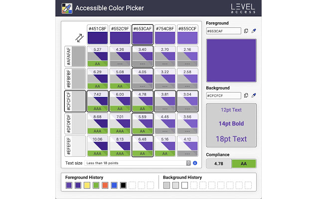
Leverage this in-browser color picker to evaluate the accessibility of your color palette. This tool allows you to select foreground and background colors and will determine the color contrast ratio between them. If your colors do not have sufficient contrast, this tool will suggest similar colors that are compliant.
Additional features
* History of last 10 foreground and 10 background colors selected
* Preview sample text using selected colors
* Toggle foreground and background to test variations
* Editable hex codes with simple copy to clipboard button
Το καλύτερο από όσα έχω δοκιμάσει!
This is a very useful tool for accessibility audits. I particularly love that it has a magnifier to pick a specific pixel, that it works on background images, and it grabs the non-focused/hovered color, which can be really hard to grab with many other tools.
It’s missing two features to make it absolutely perfect – it needs a way to get focused/hovered colors because sometimes you have to check those (especially for custom focus highlight colors), and it needs an a permalink feature that I can paste into reports to take the reader to a website that shows the colors and contrast level and some extra information. Until it adds a permalink, I will continue to paste permalinks to a competitor’s online contrast checker into my audit reports. – Miranda Capra, PhD, CPWA
Super simple to use. Very intuitive. Accessible. Great job.