3.4
28
3854
25

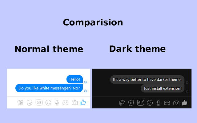
This is an unofficial extension that changes the appearance of the Messenger.com to a much darker. It’s much more pleasant for the eyes at night, and even during the day.
Just click the extension icon to toggle on/off dark theme.
How to use:
Install extension, go to messenger.com and click on extension icon. That’s all!
NEW: Dark Theme works on chats open in messenger application at facebook.com
Thanks 🙂
Not really working.
Its just the same like without it and I can’t see what I’m typing using this ugly extension
Can’t even dark mode!
Not working? It changes the background color of just my chat-bar, and turns some text fonts white, but it’s still white background over-all.
It does not longer work in chrome
Nie działa na chromie
Does not work for Opera Browser
Great addon. It seems it stopped working after Messenger updated today though. Could you fix it?
zajebiste a wy dalej wypalajcie sobie oczy
//10.12.2020, fixes needed
Not work. Messanger.com still white. Just “Chats” disappear when turn on “night mode”
It only makes some icons blurry and make some parts of page design disappear
Works idealy in facebook and messenger, doesnt lag on my laptop, loads fast enough. I like it!
TRY to include in your title the (DTM) for us to remember easily. It works fine for me unlike from the others. REALLY COOL!! ..Thanks though
This one actually works
This is so better that the other ones that suspiciously makes my chrome eat 80% cpu load for some reasons..
very good
Thanks a ton for it!
Lovely!
Issue: the text is hardly visible in poll title and poll options! please change font color to white/lightgrey, now its black on darkgrey background.
Thank you!
Doesn’t work at all.
Great extension. Maybe the white text is is little too bright.. some grayish color would not cause a harm ;), but that’s just a minor and maybe selfish wish 🙂
Works great
Greate job done! Nice and smooth color balance of all elements.
Next I’m awaiting dark theme for all webpages .
Really nice look to it and runs smoothly. Two slight issues: 1) Quoted replies (“You replied to Person”) leave a white bar going across the screen, 2) The settings menu can be hard to read due to the text foreground colours. Other than that it looks great
The two star rating needs to go away. Works fine with good runtime.
I’d give it a perfect rating if only the text box is also black and not white. I can’t see what I’m typing because the text color is white too.