3.7
52
12887
10

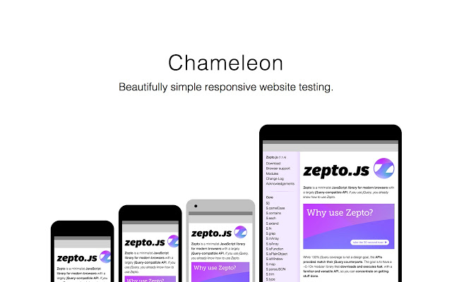
Chameleon lets you quickly view the responsiveness of your web app in multiple device viewports.
Simultaneously review your site’s behavior on a myriad of different screen sizes.
For testing, Chameleon opens your site in a new tab and shows you both the portrait and landscape orientation of each device.
Add and configure as many viewports and devices as you need.
View the source code on Github: http://stefanritter.com/chameleon/
BIEN
pas de souci
video indirme için bulunmaz nimet
muy buena
helpful
Like it
foarte utila
So helpful!!
Running well, but unfortunately it’s starting to have problem when adding a new device in the option page. Once you add a new device all existing iframes will have the same width.
meget brugbar extension. Nemt og hurtig